Carewell, an e-commerce site and resource for caregivers, began as a redesign project. The pace quickly picked up when the client opted for a name change, leading to a complete brand overhaul.
This broadened my responsibilities to encompass visual and brand design, as well as the creation of business and marketing materials, allowing me to collaborate closely with the brand’s founders.
MY ROLE
Lead UI/UX Designer & Visuals
PROCESS
Wire framing, UI Kit, User Testing, Visual Design
Client
Carewell
THE CHALLANGE
Startup Brand Update
The founders decided on name change, this was pivotal for the brand’s new direction, and demanded a full reevaluation of the brand’s identity
The brand update for Carewell presented significant challenges, primarily due to the sudden shift from a straightforward redesign to a full-scale brand overhaul from its visual elements to its messaging across all platforms. This rapid transformation required swift adaptation and a highly collaborative approach to align all stakeholders with the new brand vision. Additionally, ensuring consistency across all customer touchpoints became a critical task, as it was essential to maintain trust and recognition among the existing user base while attracting new customers.
THE RESEARCH
The Approach
We started the project by reviewing the existing application and a deep dive into understanding the user needs.
This analysis provided us with valuable insights into user behavior and interaction patterns, helping us identify areas that required optimization and enhancement. We then gauged our performance against competitors. Based on this comprehensive review, we prioritized features and design changes that would significantly improve user experience and align with the strategic goals of the Carewell C-suite.
ABOUT THE BUILD
Site & Analytics Audit
We ran a series of deep dives into the analytics with the various stakeholders to identify the state of the current iteration.
We worked with different stakeholders to understand the current site’s performance by looking closely at the data. First, we audited the entire site to see what was working and what wasn’t. We also conducted user surveys and analyzed specific tasks to prepare for the redesign. This process helped us make informed decisions, focusing on real user needs and areas where the site could be improved. This set the stage for us to start making changes aimed at enhancing user satisfaction.
ABOUT THE BUILD
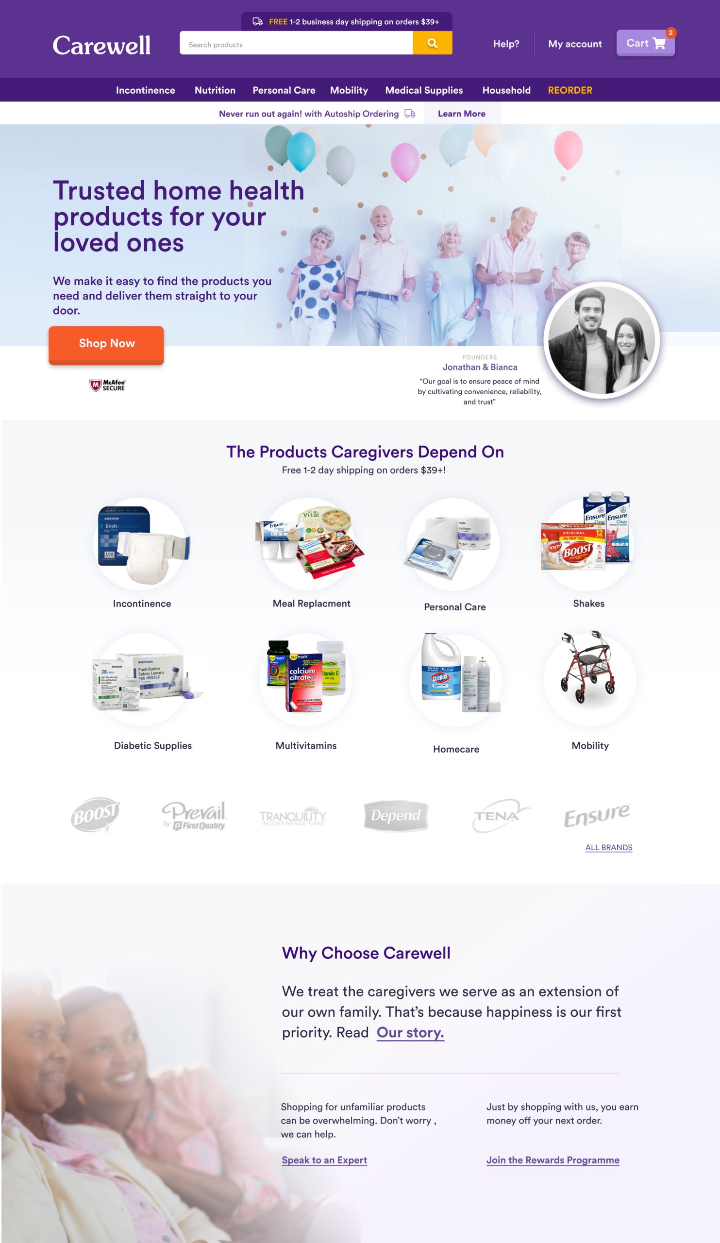
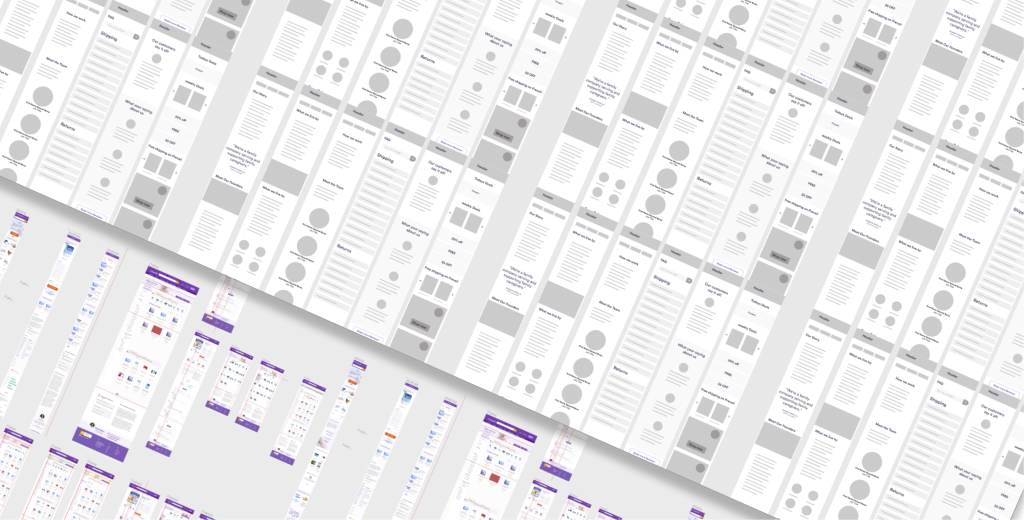
The Flows + Wireframes
Wireframes were created to block out sections that could be reused on the various pages.
This approach allowed us to establish a consistent layout and user interface elements that could be seamlessly integrated into different parts of the site. By reusing these sections, we maintained a uniform brand experience throughout the user journey. This not only streamlined the design phase but also facilitated quicker adjustments based on user feedback and testing results
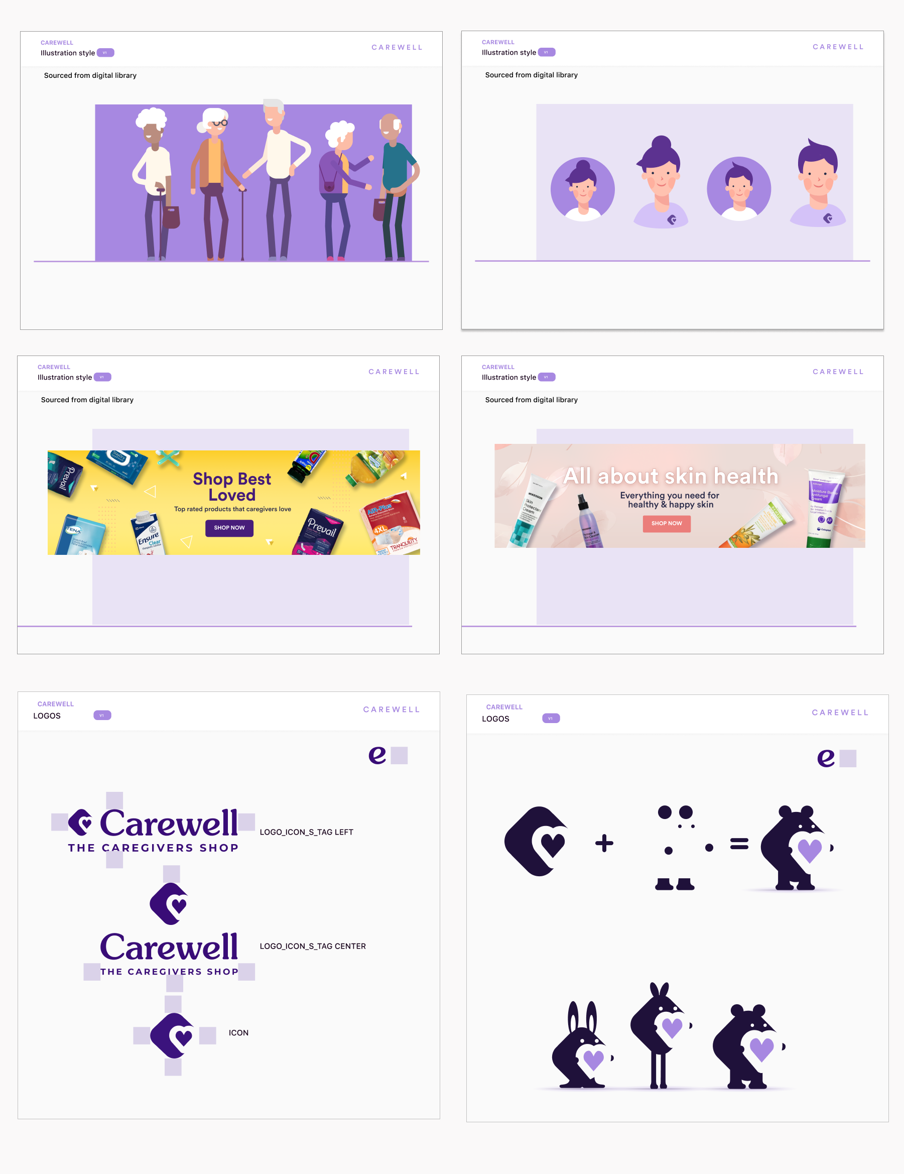
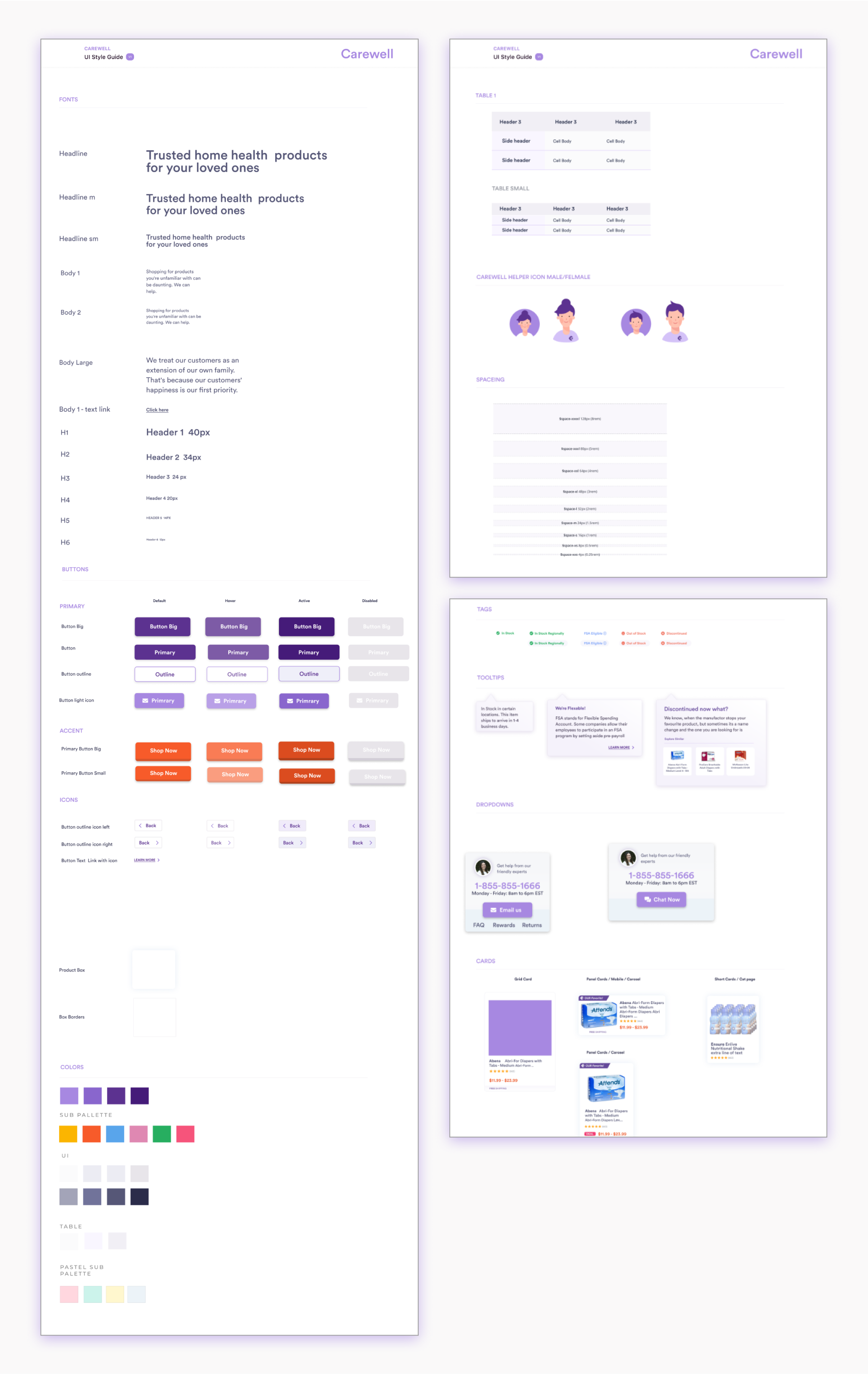
ABOUT THE DESIGN
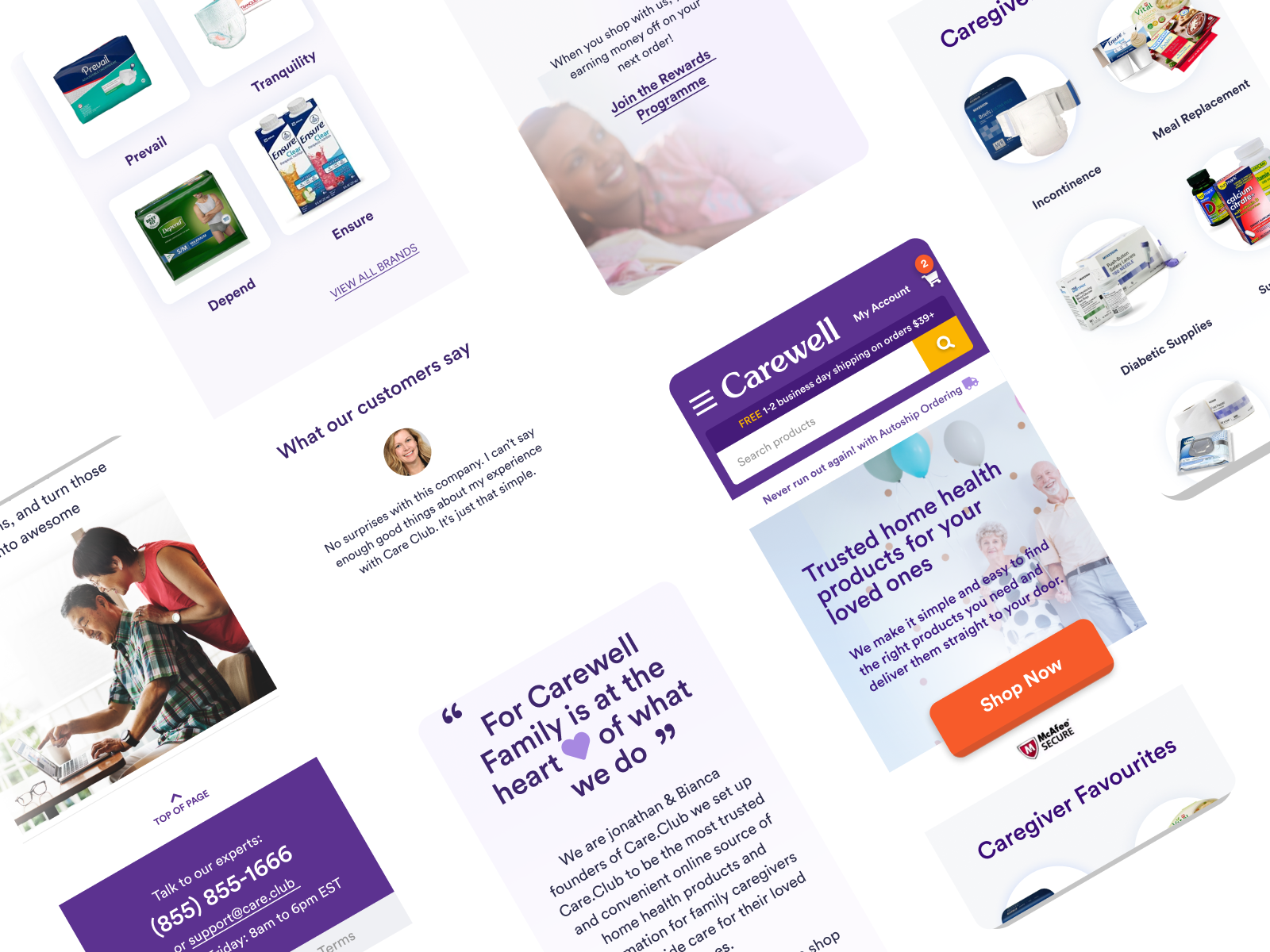
Visual Design
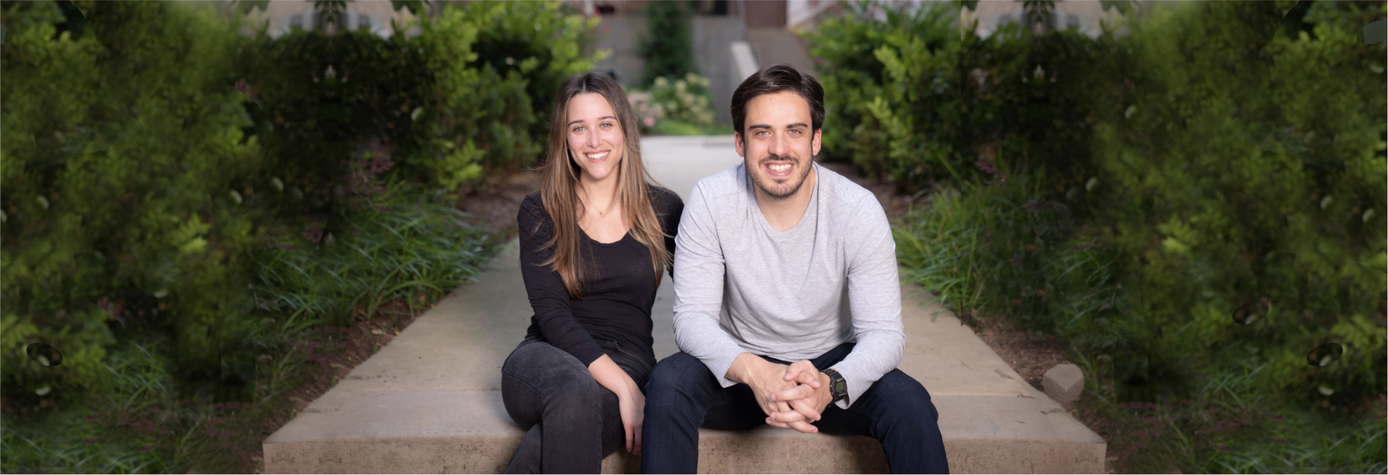
Most carers work alone and we strongly felt that the new brand to have a warm and friendly feel.
This intention guided our selection of color schemes, typography, and visual elements, aiming to create an inviting and approachable atmosphere for users. We focused on incorporating light, bright colors and clean lines to convey freshness and modernity, while ensuring the design remained user-friendly and easy to navigate. This approach not only revitalized the brand’s image but also reinforced its commitment to providing an accessible and supportive experience to its customers.
MARKETING ASSETS
Pitch decks to Canva templates
This project became an opportunity to redefine how the startup presents itself across all platforms.
From designing email funnels that optimise customer engagement to crafting persuasive investor pitch decks, each element was aligned with the new brand identity. Additionally, I developed Canva templates to ensure brand consistency, empowering the startup team to maintain visual coherence in their ongoing marketing efforts.
Takeaways
The adaptability of the founders to pivot where needed not only made the project unique but also highlighted the dynamic nature of working with fast-paced startups.
You have to embrace flexibility
This project began as a site redesign but evolved dramatically into a full business rebranding initiative. The startup’s ability to pivot quickly was crucial, allowing us to tackle diverse design challenges that were both stimulating and critical for the brand’s evolution.
Impactful Outcomes and Growth
The rebranding was more than just a visual makeover; it was a strategic move that significantly boosted the company’s market positioning. The successful relaunch led to remarkable business growth, enabling the startup to secure a substantial $5 million in seed funding, followed by an impressive $25 million in a second funding round in 2021.